
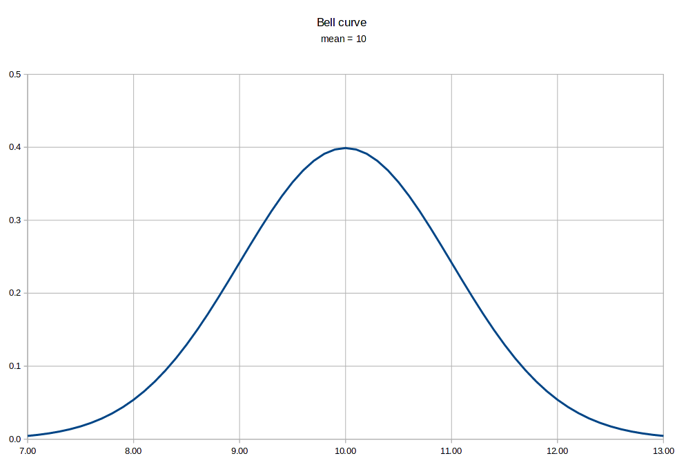
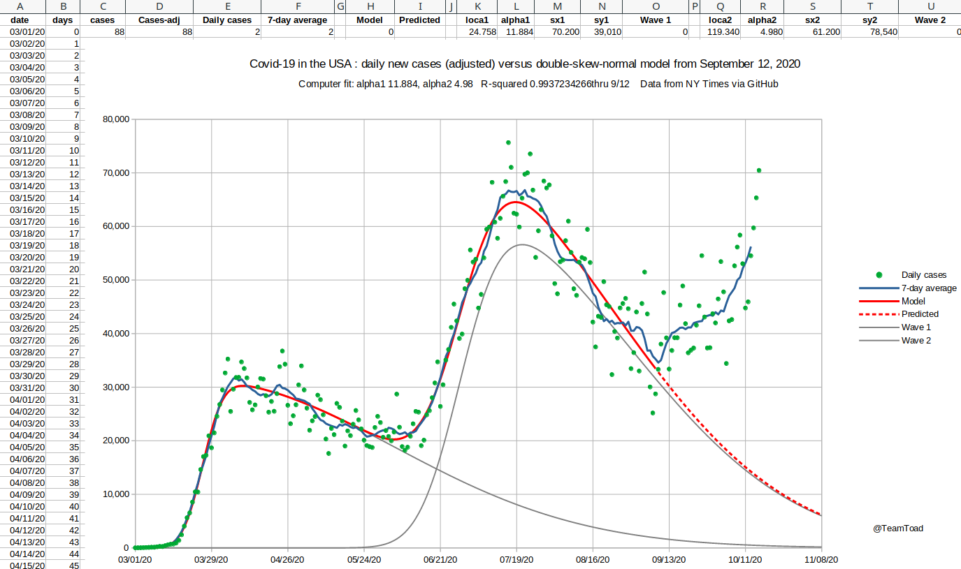
| "In what's called 'Farr's Law,' dating back to 1840, all epidemics follow a roughly bell-shaped curve. As the most vulnerable victims are nabbed first, one existing case leads to more than one. But eventually each new infection causes only one other, and then less than another. That's why ultimately all, since before the Plague of Athens (433 BC) are self-limiting. They peak and fall without benefit of the CDC, WHO, vaccines or effective treatments." (Forbes, Oct 23, 2014). |  |
|
|
 |
 |
 |
 |
 |
phi AKA ø function 
|
Φ function 
|
|
 |
 |
 |
 |
|
August 28, 2020  |
August 28, 2020  |
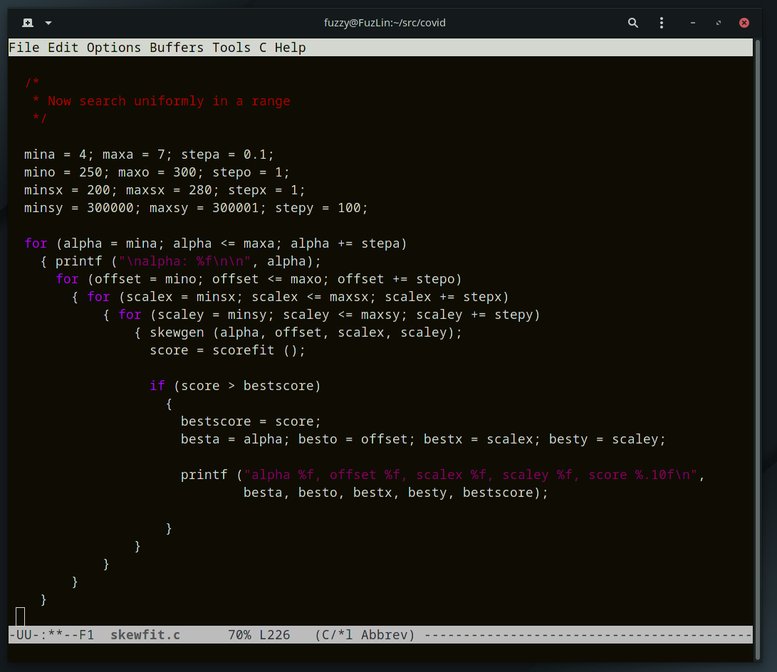
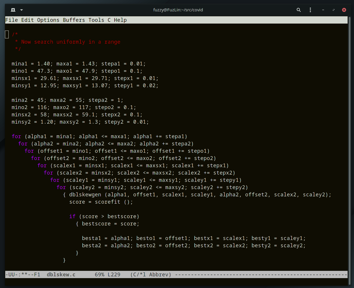
| Starting in the fall, the cases started trending above the double-skew model, and the need for a three-wave curve fitter became apparent. But a brute force or uniform search was out of the question for twelve dimensional space. Even hill climbing is a challenge in that many dimensions, because there are 531,440 directions in which to move (allowing all the diagonals). |
|
|
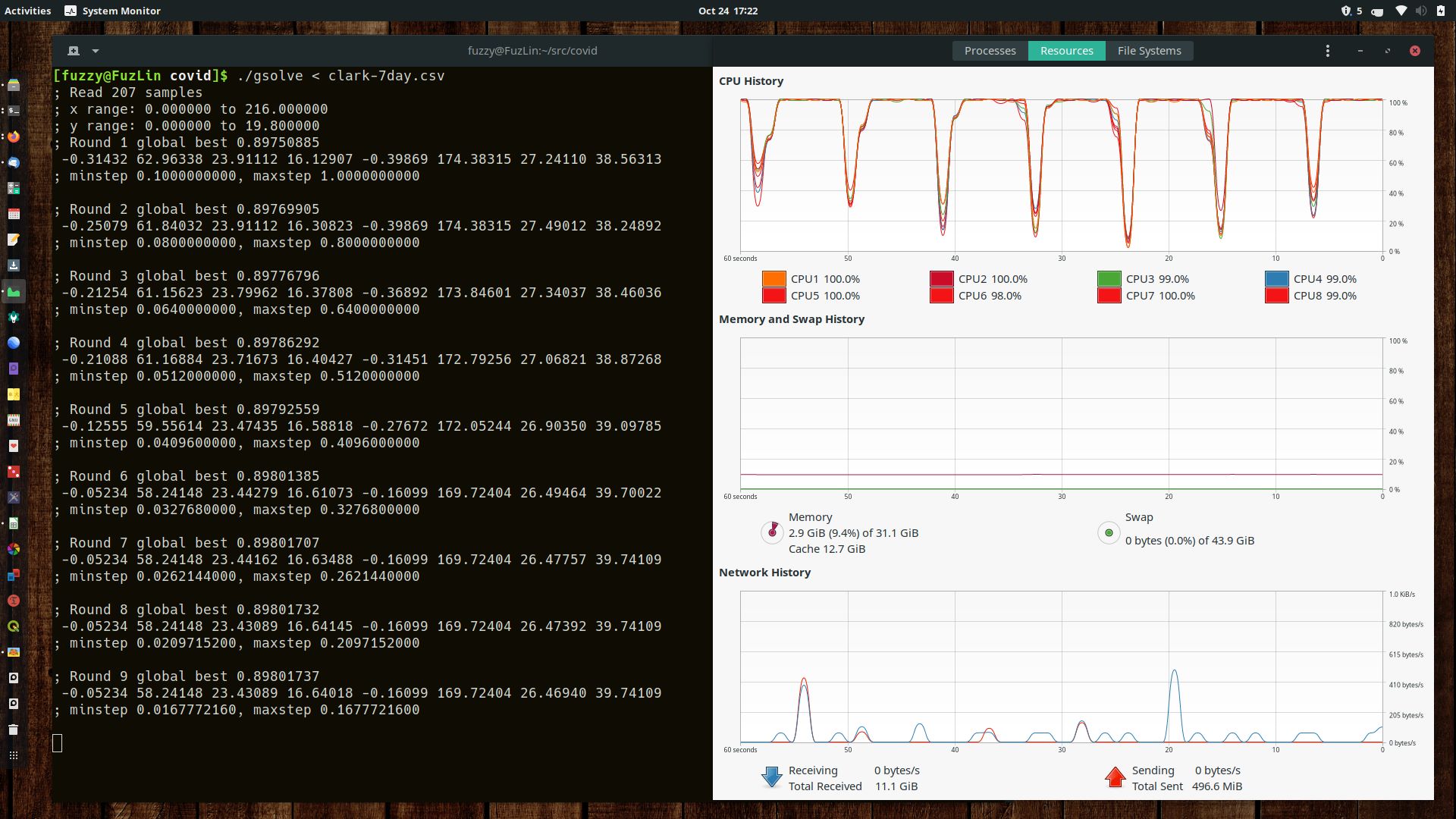
I broke the usual evolutionary loop into 20 rounds.
In each round a thread would be started for each subpool, and would run for a few
thousand generations. At the end of the round all the threads would end, and
the entire pool would be randomly shuffled.
That way the best solutions would percolate throughout the whole gene pool, and be used by all the cores in the next round. You can see in the system monitor display on the right that for a time each CPU core was working at 100%, with brief periods where the only one core was working to shuffle the main pool. |
 |
|
December 24, 2020 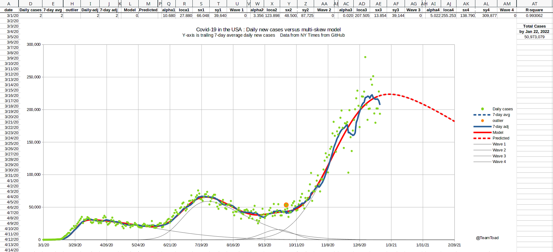 |
December 24, 2020 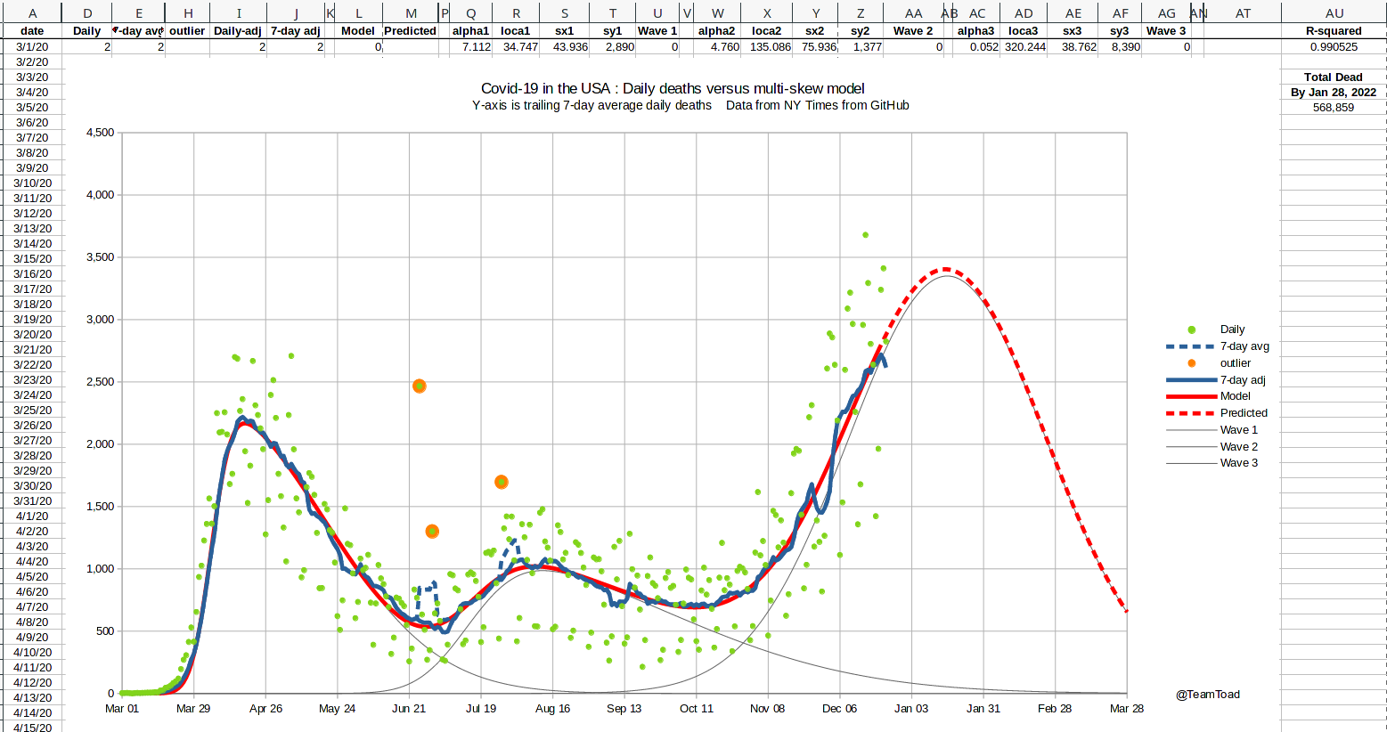 |
|
Three major holidays occured in the growth phase of the third wave:
Thanksgiving, Christmas, and New Year's.
Because of the likelihood of underreporting cases during these holidays, and the possibility of delayed reporting of deaths, I needed to adjust the curve fitter to handle missing data (you can see the notches in the graph shown at the right showing missing cases). I used an upper-bound least-squares scoring function for the mid-January curve fitting run. Basically the actual squared error was used if the model under-predicted the data point, but only 25% of the distance was used if the model over-predicted the data point. This modification was only used for data after November 16th, to allow for missing data from Thanksgiving on. This change in scoring causes the fitted curve to skim the top of the data points, and to ignore the valleys. That result is shown by the red line in the graph shown to the right. The R-squared measures are still reported using standard least-squares. |
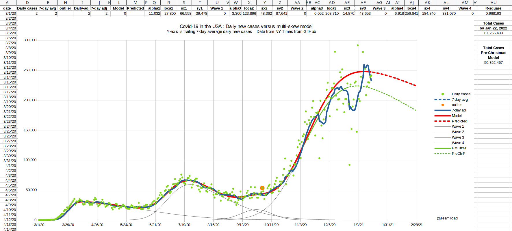 The 2020 holiday season Daily new cases |